This article is a summary of the subscriber piece published on September 17, 2026.
Opening
The Fed raised rates on September 16, right at what looks like an OECD CLI peak. The vote was unanimous, and the message was that this inflation needs cooling.
For several months I have been mapping the bottlenecks inside the AI wave, and I settled on a few as core: power, memory, and optical interconnect. In this piece I set that search aside to focus on macro. The bottlenecks are still bottlenecks, but I judge that the market has recognized them well enough. Of macro, earnings, and sentiment, macro is the one that matters most at this moment. So this piece answers a single question: where does the economic clock point, meaning where we sit in the business cycle, and what do I watch for the next six months?
1. Where Are We Now
Three measures define the present: the leading indicator, rates, and semiconductor capital spending.
The leading indicator here is the OECD CLI (Composite Leading Indicator). The OECD publishes it monthly for each country, bundling series that move ahead of the real economy, such as new orders, share prices, interest rate spreads, and consumer sentiment, to show the direction of the economy a few months out. The long-term trend is set at 100, so a reading above 100 that keeps rising signals expansion, and a slowing climb signals that a peak is near. Because it is amplitude-adjusted against its own history, it moves within a narrow band around 100, which makes overheating and contraction relatively easy to read. That index now sits near a peak, and rate hikes have begun right there.
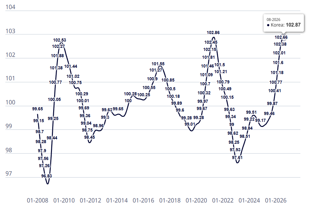
Korea came in at 102.87 for August, a record high. But the monthly gain fell by half, from 0.41 in spring to 0.21 in August.
[Chart 1: Korea CLI, OECD]
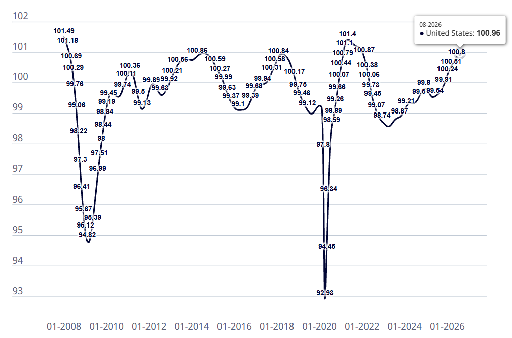
The US read 100.96 for August, level with the April 2018 peak of 100.94, while the monthly gain was only 0.07. Both countries look near a peak. Peaks are only confirmed in hindsight and recent readings are revised often, so “near a peak” is as far as I will go.
[Chart 2: US CLI, OECD]
On rates, the Bank of Korea hiked in July and August, taking the policy rate to 3.00%, and Korea’s three-year government bond yield is in the high-3% range. The Fed raised by 25bp to 3.75–4.00%, its first hike since 2023. The dot plot shows one more hike this year, none next year, and cuts penciled in from 2028. The trigger was the energy shock that began with the war involving Iran.
Semiconductors show prices and share prices moving apart. DRAM contract prices are rising, yet the major names have corrected sharply. Meanwhile capacity spending continues, HBM (high-bandwidth memory attached to AI chips) volumes are locked in under contracts running more than a year, and the shortage is expected to last into 2027. Prices up, share prices down first, investment continuing.
2. What Past Moment Does This Resemble
The US: August–September 2018
2021 also saw rates start moving at a leading-indicator peak. But the US policy rate was near zero then and the Fed was still buying bonds, so markets felt more tailwind than drag. 2018 is the closer match. A September hike, a final hike in December, and balance sheet runoff all overlapped, and the 10-year yield climbed from the high 2% range past 3.2% in October. Memory contract prices were still rising but decelerating, and Micron ($MU) fell sharply after peaking in late May. Rate level, policy direction, the burden from long yields, and the shape of the memory cycle all line up. Taken together, I judge August–September 2018 to be the closest match to today.
Korea: Second Half of 2021
Korea’s index shape resembles 2010, while its rate path resembles 2021. In 2021 Korea’s CLI peaked at 102.86 in May, the policy rate rose from 0.50% to 0.75% in August and 1.00% in November, and the three-year yield jumped from 1.1% to 2.0%. SK Hynix (000660 KS) fell 40% from its March high by October, and it is down 40% from its July high now. Back then, too, the large caps turned first, the Bank of Korea hiked ahead of the Fed, and the index held up as money rotated into other sectors. Judging by the shape of the burden, October–November 2021 is the closest match.
What Markets Did in the Six Months After the Peak
A peak in the leading indicator is where expectations run highest. What broke first from there were the stocks that had been rising on those expectations, while the real economy ran on for a few more quarters. I went through what actually rose in both periods, and the sequence was the same.
One: Expectations Break First
That was the memory large caps. Contract prices were still rising when share prices turned: Micron in the US, Samsung Electronics (005930 KS) and SK Hynix in Korea. Share prices look further ahead than prices do.
Two: What Is Already Committed Keeps Going
The first is volume. Fab investment is a multi-year decision that does not stop midway when conditions change, so revenue at materials, components, and back-end firms follows the capacity schedule. In this cycle, the volume going into leading-edge conversion and advanced packaging is existential spending, which makes it even harder to pause. That is why the large caps’ price expectations and the suppliers’ volume separate.
The second is rates. Hikes already underway continue. Lending rates rise first, and insurers’ investment yields improve. After May 2021 in Korea, banks and insurers were the winners.
Three: The Correction Comes, and Long Yields Turn Down
By August 2018, US long yields were already near a cycle high. Once equities started correcting, yields soon topped and came down, and the Fed then stopped hiking. The correction spared nothing. What mattered in that stretch was the direction of yields.
Four: Real Assets Moved Sharply
Gold is mostly explained by real rates, the nominal yield minus expected inflation. Since gold pays no interest, a rising real rate hurts it. In 2018 the nominal yield fell quickly, the real rate dropped, and gold rose. In 2021 the Fed signaled tapering, the market priced in rising nominal yields first, and gold could not rise. Gold trades on where real rates are heading.
Energy fell hard in both periods, and supply was the reason. In 2018 WTI fell from about $75 in October to $40 by late December, as US production hit a record and Saudi Arabia raised output. In 2021 it dropped more than 25% from near $85 in early November, triggered by Omicron and rising supply. Today WTI is near $100. Iranian and Saudi infrastructure is blocked and refining capacity in particular has grown short, so no channel for more supply is visible. That is why I doubt a single rate hike will bring oil down. What remains is either a supply-side break or demand collapsing on its own if $100 oil and a 5% long yield persist.
Five: After the Correction, They Separate
The chip leaders rebounded first, even while DRAM prices were still falling, but then stalled. The volume names fell with everything in the correction and kept going afterward. Prices are made by expectations and the economy; volume is made by contracts.
3. What This Means for Korea
My Read
Korea has worked through its internal cycle and correction over the past couple of months, and energy could make its tightening longer. SK Hynix’s 40% drop compressed into two months what took seven in the past. But both past declines came after DRAM prices had already turned, and contract prices are still rising now. Whether the market was right or overshot will show in the pace of contract price increases. Korea also imports all of its energy, so oil has a shorter path into core inflation (inflation excluding energy and food) than in the US. Even if the Fed stops, the Bank of Korea may not be able to.
What I Watch for the Next Six Months
First, semiconductor volume. The suppliers worked through the correction in both 2018 and 2021, and I see this as nearly the only position that holds whichever path arrives. Second, rate-hike beneficiaries: banks and insurers. The longer the Bank of Korea runs, the further forward they come; if it ends quickly, they fade back. Third, the conditions for the large caps to return. Samsung and SK Hynix are not at the front right now. But a 40% decline alongside rising earnings has no precedent, and as long as contract price increases hold, I expect earnings to back any rebound.
I am also watching nuclear-centered energy policy, which has drawn attention whenever oil climbs. The full piece lays out, in a table, the companies I track in each of these four positions and the role each one plays: an anchor that holds through the phase, a conditional bet tied to the Bank of Korea, or a place to check return conditions.
4. What This Means for the US
My Read
US long yields have already climbed into cycle-high territory, and this is where we wait for equities to react. In October 2018 the 10-year hit a seven-year high, and equities broke down quickly afterward. Today the 10-year crossed 5% in mid-September. The trigger has been pulled; what matters now is timing. I cannot treat a Fed moving because of oil as something to simply hold through.
The six months from September 2018 ran in this order: yield peak, equity drop, Fed pivot, semiconductor rebound. The S&P 500 fell about 20% to its December 24 low and mostly recovered by the following March, the Fed paused in January, and semiconductors rebounded before earnings bottomed. The full piece includes a period-by-period table of how the Nasdaq, the Philadelphia Semiconductor Index, the 10-year yield, DRAM contract prices, and the Fear & Greed Index moved over the same stretch.
What the Curve Says
When the Fed began hiking at a leading-indicator peak, long yields turned down after a lag in both periods. In 2018 the 10-year peaked at 3.15% and came down with the correction; in 2021 it fell from 1.62% to 1.28% within three months. Today it is 5.01%. That starting point is too high to drag the tightening out the way 2021 did. Either the economic clock stops or the hiking does.
Real rates have risen from +2.0% to +2.57% since April, because nominal yields climbed 0.6pp while 10-year expected inflation stayed pinned at 2.33%. The pace is about twice that of 2018, and the level is the highest since 2008. Until oil comes down and nominal yields break, I read this as a rising real rate environment, with gold suppressed within it. One variable could shake that call. This inflation was caused by a war. If geopolitical risk intensifies, safe-haven demand can outweigh the pressure from real rates, and gold could hold up for a stretch.
What I Watch for the Next Six Months
While real rates climb, gold is suppressed, long bonds are pressured, and the dollar rises. When this ends depends on political variables around Iranian and Saudi infrastructure, so it cannot be forecast. But I see only two ways out.
Path one: an equity correction. If equities react to the break above 5%, the sequence follows the fourth quarter of 2018, fast and rough, within weeks. Equities fall sharply, financial conditions tighten, and as the market erases the Fed’s hiking path, long yields fall first. That is where long bonds pay off. Gold gets sold for the first few days. It has risen 18% over the past year, so positioning is crowded, and whoever needs cash sells what has gone up. Then safe-haven demand arrives and a base forms.
Path two: oil falls. This path opens only when supply loosens or demand gives way. It unfolds gently, over months. When oil comes down, expected inflation falls first and long bonds start rising. Gold, though, stays suppressed: if expected inflation falls faster than nominal yields, the real rate actually rises.
Put the two side by side and one thing is shared. On either path, gold is suppressed at the outset. On path one it falls with everything for a few days and then bases; on path two it stays suppressed. Long bonds rise on either path, and the dollar passes its peak. The full piece compares speed, the dollar, gold, long bonds, energy, and equities across the two paths in a single table.
The Four I Watch
In the order they move.
First, the dollar. It rises while real rates and oil climb together, and its real decline came only after the Fed turned toward cuts. Second, gold. It has already begun to be suppressed. It stays pressured while real rates rise, and it is the first to turn the moment long yields pass their peak, which makes it a confirming indicator. Gold miners move more than gold itself because energy costs compound the effect. Third, long bonds. Their moment has not arrived. They rise first after a correction and are pressured until then. I read this as the shorter tightening. Fourth, energy. It moves last, yet it is the starting signal for everything. While oil stays above $100, energy producers lead.
I do not bet on equities falling; it does not fit the premise that corporate intrinsic value compounds over time. Real assets, though, always trace overheating and release, so I use inverse products (products that gain when prices fall) suited to the phase. The positions split by phase. Now, with real rates rising, they are energy producers, the dollar, gold inverse, and gold miner inverse. Gold miner inverse moves more than gold inverse because energy costs compound. When a path opens, the weight shifts to long bonds, crude inverse, and energy equity inverse. Once the Fed turns, I expect those inverse positions to reverse. After the December 2018 pivot, gold miners rose nearly 40% in three months.
Inverse and leveraged products reset daily, so holding them long erodes returns even when the direction is right, and ETNs can be called or delisted by the issuer. The full piece tables the ETFs and ETNs I watch in each phase with tickers, leverage, and structure (ETF or ETN), and separately notes the risks to check before holding each one: actual returns over the past year, reverse split history, trading liquidity, and futures roll costs.
5. The Turn and the Six Months Ahead
In Three Sentences
Both countries sit near a leading-indicator peak with hikes underway. What survived to the end in both past periods was semiconductor volume, and what changed the board was rates and energy. So for the next six months I watch volume and rate beneficiaries in Korea, and the direction of rates and energy in the US.
Korea is mid-to-late by the 2021 template, and the US is early by the 2018 template. The deciding indicators for Korea are the pace of DRAM contract price increases, core inflation and the three-year yield, and the won-dollar rate; for the US they are oil, expected inflation, core CPI, and the direction of yields after a correction. With US yields pointing up again, Korea’s clock is likely to be set from the US side.
Three Places This Differs From the Past
The first is the character of the tightening. This hike responds to energy-driven inflation, and the dot plot suggests it ends quickly; that kind of monetary policy has mostly ended early or been reversed. The second is that the memory shortage runs longer. In 2018 contract prices turned within a single quarter, but now the shortage is widely expected to last into 2027, so earnings may break later. The third is that the power bottleneck has no precedent. In this cycle, power is genuinely in short supply for running AI facilities, and I will keep reading it on its own terms, separate from the phase.
Placement on the Map
The bottleneck map I have built so far, the set of AI supply-chain chokepoints this research tracks, stays as it is; only the order of what stands at the front changes. Front-end materials and components with advanced packaging, and financials as rate beneficiaries, are what this phase pushed forward. Power and optical interconnect stand on structural grounds independent of the phase, and bio 2.0 comes forward the more the economy cools.
Closing
The phase has turned. We have moved from a time when finding bottlenecks was enough to one where we also have to read what follows a peak. In the past, a phase took about six months to resolve, and I am treating this one the same way. For Korea I watch volume and rate beneficiaries while checking the conditions for the large caps to return. For the US I watch the dollar, gold, long bonds, and energy to see which of the two paths opens.
If the sequence is what you came for, this piece is enough. Everything trimmed from it remains in the full piece: item-by-item tables setting today against two past phases for both Korea and the US, the companies I track in each of Korea’s four positions and their roles, the phase-by-phase ETF and ETN list with the risks of each product, and a scenario table for each asset on both paths. You can find it through the link in my profile.
🌱 Growth Wave · Full Deep Dive
This is a summary. The full piece, with the comparison tables, tracked positions, and ETF and ETN details, is available to subscribers.Read the full research →
Ciao. 🌱
This newsletter is for informational purposes only and does not constitute investment advice or a recommendation to buy or sell any security. The author may hold positions in the securities discussed. Do your own research and consider your own circumstances before investing.